Bivariate mapping  in R with tidycensus and biscale
- 6 mins Introduction
In my last post I shared the tidycensus package which is a handy tool that allows you to retrieve demographic and economic data from the Census Bureau along with spatial geometries. Today, I’m taking it one step further and introducing the biscale package.
biscale is a really fun package that let’s you easily create bivariate choropleth maps. These types of maps allow you to display two different quantities across a geographic region, and to visualize the relationship between these variables using color.
Basic usage for biscale
Simply put, biscale helps produce the classes from two different variables to aid in bivariate mapping. The primary function to use is bi_class. You must provide it with:
| Arguments | Description | |
|---|---|---|
| .data | dataframe, tibble, or sf object | |
| x | x variable | |
| y | y variable | |
| style | string identifying the style used to calculate the breaks. Currently supported styles are “quantile” (default), “equal”, “fisher”, and “jenks”. | |
| dim | The dimensions of the palette, either 2 for a two-by-two palette or 3 for a three-by-three palette. |
Let’s try it out!
library(tidyverse)
library(sf)
library(tidycensus)
library(mapview)
library(biscale)
census_api_key(YOUR API KEY GOES HERE)
# Get data with geometry
# B19013_001 = MEDIAN HOUSEHOLD INCOME IN THE PAST 12 MONTHS
# (IN 2017 INFLATION-ADJUSTED DOLLARS)
ca_income <- get_acs(geography = "county",
variables = "B19013_001",
state = "CA",
geometry = TRUE)
# B02001_002 = White race population
ca_white_pop <- get_acs(geography = "county",
variables = "B02001_002",
state = "CA",
geometry = FALSE)
# B01003_001 = total population
ca_tot_pop <- get_acs(geography = "county",
variables = "B01003_001",
state = "CA",
geometry = FALSE)
# Join race to income with geometry
# calculate percent white and percent minority
ca_combined <- ca_income %>%
left_join(ca_tot_pop %>%
select(NAME, pop = estimate)) %>%
left_join(ca_white_pop %>%
select(NAME, white_pop = estimate)) %>%
mutate(
perc_white = white_pop / pop,
perc_minority = 1 - perc_white
) %>%
rename(income = estimate) %>%
filter(!is.na(pop), !is.na(income))
# create classes
data <- bi_class(ca_combined,
x = perc_white,
y = income,
style = "quantile",
dim = 3)
# fill no data locs
ca_fill <- ca_income %>%
left_join(ca_tot_pop %>%
select(NAME, pop = estimate)) %>%
left_join(ca_white_pop %>%
select(NAME, white_pop = estimate)) %>%
mutate(
perc_white = white_pop / pop,
perc_minority = 1 - perc_white
) %>%
rename(income = estimate) %>%
filter(is.na(pop) | is.na(income) | is.na(white_pop)) %>%
mutate(bi_class = NA)
all_data <- data %>% rbind(ca_fill)
# create map
map <- ggplot() +
geom_sf(data = all_data, mapping = aes(fill = bi_class), color = "white",
size = 0.1, show.legend = FALSE) +
bi_scale_fill(pal = "DkBlue", dim = 3) +
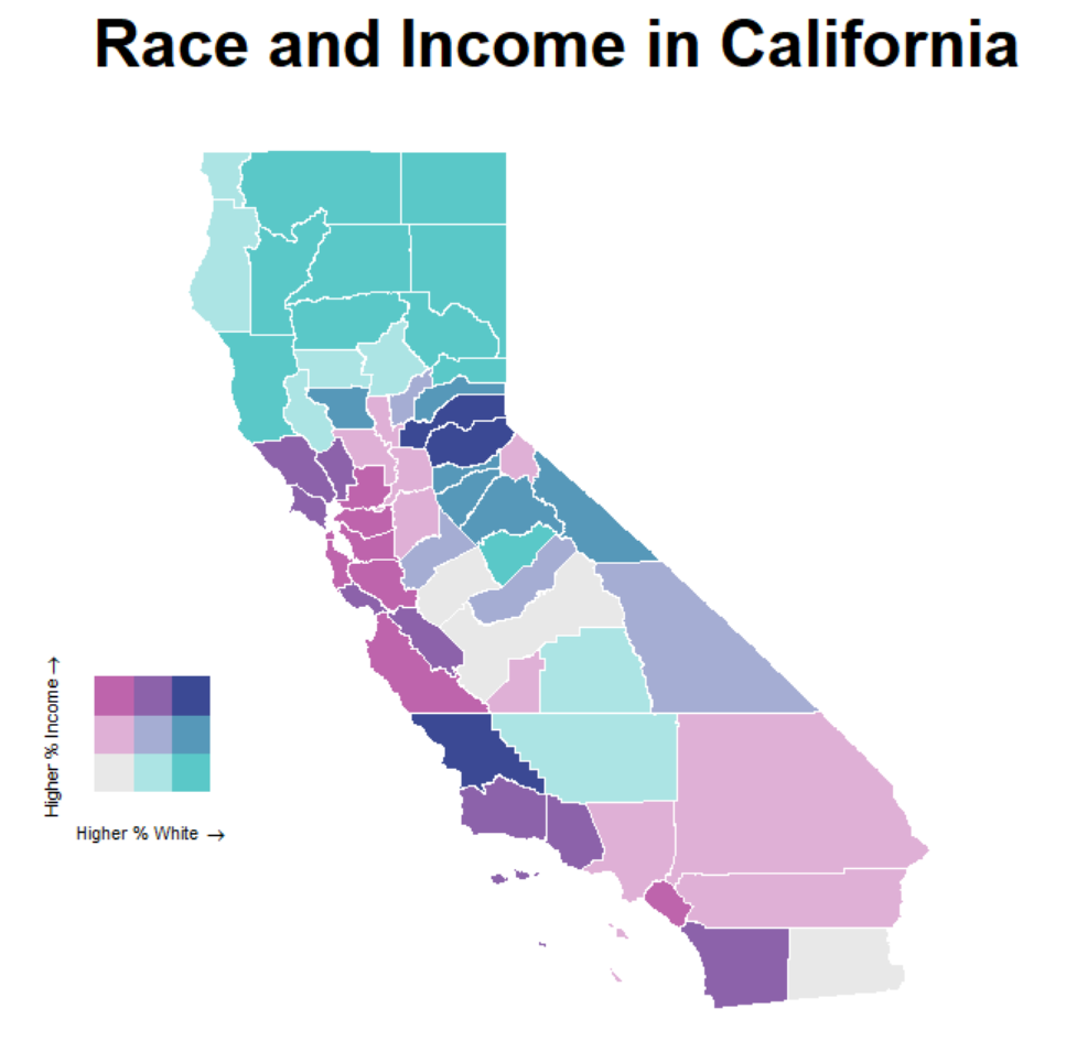
labs(
title = "Race and Income in California"
) +
bi_theme()
# create the legend
legend <- bi_legend(pal = "DkBlue",
dim = 3,
xlab = "Higher % White ",
ylab = "Higher % Income ",
size = 8)
# combine map with legend
finalPlot <- ggdraw() +
draw_plot(map, 0, 0, 1, 1) +
draw_plot(legend, 0.2, .2, 0.2, 0.2)
finalPlot

Tom Pham
COVID-19 Data Analyst